AI powered PowerBI Dashboard analyser
by Fuhad Abdulla
Transform your PowerBI insights with intelligent analysis
Try it now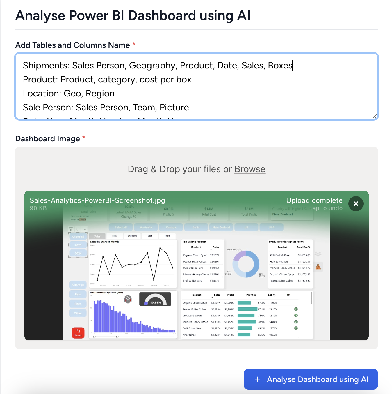
Recommendations from AI to improve PowerBI
Overall Layout and Visual Hierarchy:
The layout appears organized with a clear visual hierarchy. Key metrics are prominently displayed at the top, which helps in drawing attention quickly.
Color Scheme and Consistency:
The color scheme is consistent, utilizing a neutral background with a mix of blues for highlights. This aids in readability and focus.
Spacing and Alignment:
Good spacing and alignment are present, making the dashboard easy to scan.
Visualization Improvements:
- Additional Relevant Visualizations: Consider adding a trend analysis chart for profit over time.
- Better Chart Types: A bar chart for comparing sales and profit by product might provide clearer insights.
- Missing Key Metrics: Include a comparative metric to show performance against targets.
Performance Measures:
New DAX Measures:
- YoY Growth Rate: Calculate the year-over-year growth in sales and profit.
- Profit Margin: To give a percentage view of profitability per product.
Calculated Columns:
- Cumulative Totals: For both sales and profit to see running totals over months.
Interactive Features:
- Additional Slicers or Filters: Add slicers for different time periods.
- Drill-through Options: Enable drill-through for product details.
- Bookmark Implementations: Create bookmarks for quick navigation between key analysis points.